Showing posts with label Fantabulous Cricut Challenge. Show all posts

FCCB Challenge ~ Cool Treats and CRI-Kits Gel Pens

Hello everyone! Are you ready for another challenge? Well this week at Fantabulous Cricut Challenge Blog the theme is Cool Treats and if you’ve been having temperatures with 100+ degrees like we have been having here in Texas, you’ll be ready to create something cool! Our “cool” sponsor this week is CRI-Kits! They carry an awesome line of pens and markers for your Cricut so that you can draw an image instead of just cutting it out. Their pens come in 10-pack sets that include colors such as Neon, Glitter, Metallic, and more. They have a magnetic pen holder that works great and is SO easy to use! (Keep reading for a chance to win your own set of CRI-Kits!)

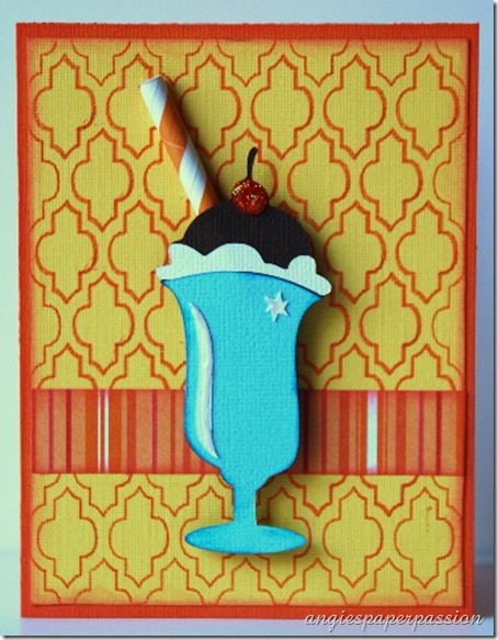
For my project this week, I couldn’t help but think of ice cream as a cool summer treat!

Ice Cream Soda card (1)

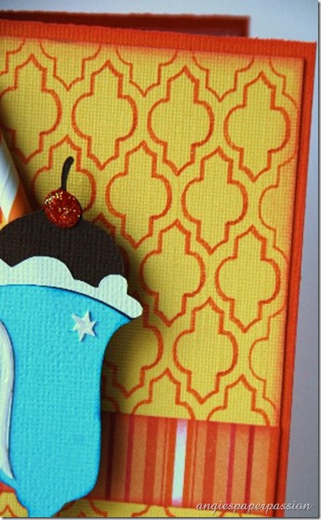
To create the background for my card, I used the CRI-Kits Glitter Gel Pens set and the Paper Lace cartridge. After choosing my paper and cardstock colors, I picked the orange glitter pen to draw the image on page 28 in the Paper Lace handbook. It’s hard to tell from the photo but it is so pretty and glittery. I sized the image with the Real Dial Size on to 4”x5.25” so it would be a perfect mat layer on my card. Then I cut it out, inked the edges, and adhered it to the card base.

Ice Cream Soda card (2)

Then I used the Nifty Fifties cart to cut out the image of my chocolate ice cream soda with a cherry on top! I didn’t use a couple of the layers that included the straw image and instead I adhered a paper craft straw to the back of my image and popped the rest of the image off the card with foam dots. The cherry was coated with Fruit Punch Stickles and I added a Viva Pearl Pen in Ice White to the  highlights on the glass.

Ice Cream Soda card (3)

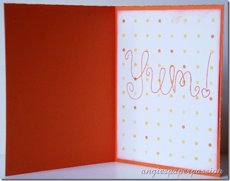
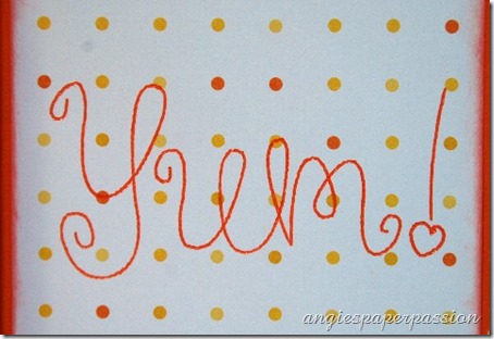
For the inside of my card, I used my CRI-Kits Glitter Pens again to “write” the sentiment with my Cricut:

Ice Cream Soda card (4)

The word “Yum!” is from Tags, Bags, Boxes & More 2! This cart is great to use with these pens and markers because one of the Creative Features on it is called Card Phrase and it was designed to be used with pens in your Cricut machine.

Ice Cream Soda card (5)

I hope that you like my ‘cool’ card today! I really had fun using the CRI-Kits and plan on using them again on my projects! All of the FCCB Design Team used the CRI-Kits gel pens this week on our Cool Treats projects so make sure to visit all of their blogs to see the creative ways they used them and then join in on the fun and create your own ‘cool treat’ project and upload it to the Fantabulous Blog for a chance to win a CRI-Kits 10 Pen set and Magnetic Pen Holder for yourself!!!

Please check out my Quick Tip Tuesday post over on the Fantabulous Cricut Challenge Blog tomorrow – I will be sharing some tips using the CRI-Kits in your Cricut!

Until next time, Happy Crafting!

Signature

50’s Inspired Set of Shaped Note Cards ~ FCCB Challenge #171

Good morning everyone!  It’s Challenge Me Monday at Fantabulous Cricut Challenge Blog and the theme this week is Shaped Cards! So after seeing my project, please go to FCCB and check out what the other Design Team members have created and then join in on the fun and make a shaped card yourself – any card as long as you have one Cricut cut on it – and upload it for a chance to win a prize from one of our sponsors!

For this week, I created a set of note cards that were inspired from the 1950’s and of course they were all made with the Suburbia cartridge!

Old Telephone (1)

The first card is the old telephone! I love all of these old images on this cart. I took two images from page 41, using the Shadow/Icon Shadow feature which is the phone’s shadow and flipped on of them upside down in the Cricut Craft Room. I made sure that they were even and then got the tops close enough together so that they could be welded. Then I cut out the two Icon shapes of the phone using two different patterned papers from Prima.

Old Telephone (2)

When I think of the 50’s I sometimes think of the “idealized version” (I know that my family didn’t live in that version but I often look at things with my rose-colored glasses on, lol, KWIM?) So I immediately thought of shows like Mad Men and I Love Lucy (I know, two VERY different shows lol) and of the stay-at-home wives doing their housework with their high heels on wearing a string of pearls! OK, back to reality! But I wanted my cards to have that same feeling so I added large and medium sized pearls to the dial, a flower cut from Artiste with Tim Holtz cardstock, and seam binding that I hand dyed myself with distressed stains from Tim Holtz.

Old Telephone (4)

I decided to add another layer to the inside so I could created my sentiment on lighter cardstock so I used the Icon feature again (no shift) and used the Hide Contour feature to hide the dial and cut it out using the TH cardstock.

Old Telephone (5)

Everyday this week I’ll show you another note card from this set so please come back tomorrow to see the 2nd card! Thank you so much for craving a little time out of your busy life to come visit me ~ I really appreciate it!

Now I hope that we have inspired you to create your own shaped card and upload it at FCCB! I know that my Design Team sisters have created some more great projects to inspire you as well!

Until next time, Happy Crafting!
Signature

FCCB Challenge #169–Set the Scene ~ Country Life Layout

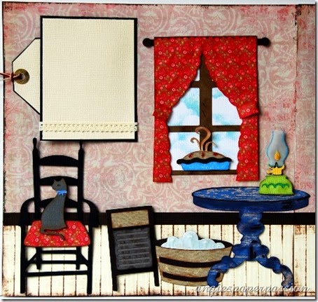
Hello to all my crafty friends! Thanks for coming by to see the next challenge for the Fantabulous Cricut Challenge Blog! This week it’s “Set the Scene” so I immediately thought of my Country Life cartridge. I love the images on there because they remind me of my Grandmother’s home many years ago even down to the pot belly stove in the middle of the main room! So this layout was done in her memory. It’s called Simple Pleasures in the Country!

Here is the 2-page layout:CountryLifeLO_AGC (1)

I used patterned paper that reminded me of wallpaper for the background and then I tried to make “wainscoting” at the bottom by scoring cardstock every 1/2” and then inking it.

Here is page 1:CountryLifeLO_AGC (2)

Here is page 2:CountryLifeLO_AGC (3)

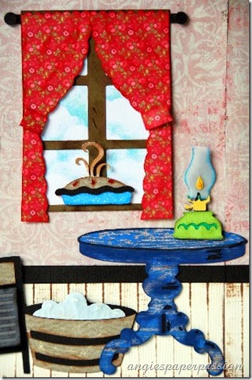
Here are the details, close up photos, and cut sizes. All of the images were cut from the Country Life cart except the table and the window frame which were cut from French Manor.

Now the cat was a little tricky at that size, well, not so much the cat itself but the cat’s eye and his tongue! The chair was over 6” but those two things were itty bitty – so much so that I just didn’t even use them! (heck, I couldn’t even find them after taking them off the mat!) So I just used markers to color in the eyes and mouth.CountryLifeLO_AGC (9)

I had to make the washboard since that is how my Grandmother washed clothes back in the day. I cut the bubbles twice – once in white cardstock and again in light blue vellum. I added Rock Candy Stickles and Glossy Accents on the bubbles.CountryLifeLO_AGC (8)

The table from French Manor only had one layer so I put two of the table images on my mat in the Craft Room and used the Hide Contour feature to make one of the images solid and that became my base which I cut out in dark brown cardstock. Then I cut the original top layer out of some patterned paper that resembled old blue wood. I used distress markers to do some extra shading. The base of the lantern was cut from light blue vellum to make it look like glass. The window frame was also cut from French Manor but I cut the curtains and the rod free hand. I took a piece of white cardstock and used blue ink and a template to make the ‘clouds’ in the background and attached it to the back of the window frame. And who can resist a fresh warm pie cooling in the window?CountryLifeLO_AGC (6)

There are many phrases on the Country Life cart and I used two of them to convey my feelings and welded the two phrases together. I made the pipe on the stove longer by using a rectangle from Cricut Craft Room Basics and welding it to the original pipe in CCR. You may not be able to see it but I tried to make the coffee pot look like the old fashioned kind by cutting it out in a light blue and then stamping random little dots all over it with white ink. I did the same thing with the pie dish. CountryLifeLO_AGC (4)

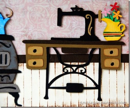
Last is the old treadle sewing machine. My Grandmother had one just like it! I also added a vase full of flowers. CountryLifeLO_AGC (5)

I added photos mats with a bit of cream lace around them and a tag behind one of the mats to add journaling and/or extra photos.CountryLifeLO_AGC (10)

I hope you enjoyed looking at my Country Life layout. Now head over to FCCB and see the other scenes that the other design team members have created! Then join us in the fun by creating your own scene and adding it to the blog. Any scene will be fine just as long as you have at least one Cricut cut in your project.

Here are the cut sizes.

From Country Life:

  • Chair – 6.375”
  • Pie – 2.5”
  • Vase of flowers – 2.5”
  • Stove – 6.375”
  • Washboard – 3.583”
  • Lantern – 2.667”
  • Sewing machine – 6.167”

From French Manor:

  • Table – 4.208”
  • Window – 5.708”

Until next time, Happy Crafting!

Signature

Wedding Card(s)! - Fantabulous Cricut Challenge #165

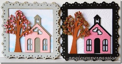
Decisions, decisions, decisions!!! One of the things I love about crafting is creating something and tweaking it to make it your own – putting your own spin on it! I love to make things, leave them out for a while, and then after looking at it over a few days, I may like to change a thing or two on it. You know what I mean! But when you have deadlines to meet, that may not always be possible – at least not right away. So that leads me to why I have TWO wedding cards for our challenge this week at Fantabulous Cricut Challenge Blog. We had to create a wedding card or gift and after I made my card (plus a couple of bride & groom gift boxes), taking my photos and uploading them, I started to have that nagging feeling that I wanted to change something. (why, oh why, can’t I make these decisions faster and make my life a little easier? LOL) So I’m going to share both of my cards with you today. Please take a look and leave me a comment on which one that you like the best! I’d really be interested in hearing your thoughts!

Here is the original card:

Wedding Cards (1)

I used the Elegant Edges cartridge to create the card base, the white mat, and the grey frame. The card is cut at 6” and I used the Cricut Craft Room to weld two of the mats together to make the card base:

Screen Shot Medium Web view

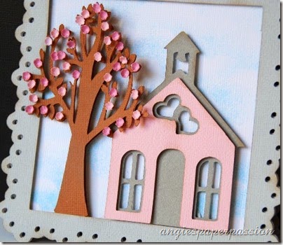
I layered the single white mat on the base and then the grey frame on top of that. The white layer is inked with light blue ink to look like clouds in the sky. I used foam adhesive to pop everything up.

Wedding Cards (2)

The chapel is cut out at 4” from the Tie the Knot cart and the tree is cut out twice at 4.5” from the Bloom Lite cart. I used a very small flower punch to make the pink blooms for the tree. After I punched them out, I used my molding tools to shape them and then adhered them on with Glossy Accents.

Wedding Cards (3)

“Chapel of Love” was also cut using Tie the Knot. I grouped the words together then welded them. This makes adhering so much easier! I also added a little of the Glossy Accents to the heart in the word ‘Love’.

WeddingProject (8)

But like I said, I had a change of heart and created this version:

Wedding Cards (4)

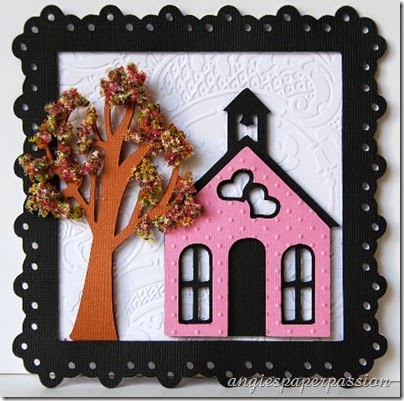
I changed the frame to black, the chapel’s shadow to black, and embossed both the white background (Acanthus by Anna Griffin) and the chapel front (Swiss Dots). Oh, I also used a deeper pink cardstock for the front of the chapel (almost didn’t catch that one, lol)

Wedding Cards (5)

The tree is the same except this time instead of using punched paper flowers, I used Flower Soft for the blooms. Have you ever tried this stuff? It’s fun to use – messy, but still fun!

Wedding Cards (6)

So there you have it – my decision process all over the place and the two cards that are the results! Have you ever done this – made something and after living with it for awhile, make changes to it? Please leave a comment and let me know. Also let me know which card is your favorite!

Wedding Cards (7)

Since this post was SO LONG, I’ll pop back in tomorrow and show you the two wedding boxes that I also made (I promise there are no changes to those!)

Now head on over to FCCB to see what the other Design Team members have created for this wedding challenge and then make something yourself & upload it to our blog! Thanks for visiting today and until next time, Happy Crafting!

Signature

Mother’s Day Card –Fantabulous Cricut Challenge #159

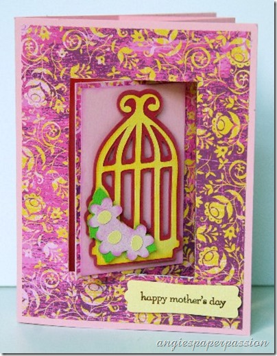
Hey there my crafty friends! I hope everyone had a great weekend. There was so much going on these past couple of days – Saturday was National Scrapbooking Day and yesterday was Cinco de Mayo! And today is the Mother’s Day card challenge on Fantabulous Cricut Challenge Blog. Come on over and join in on this weeks challenge and not only will you be inspired by my fellow Design Team sisters, but you’ll have a special card that you created yourself for Mother’s Day next Sunday. Now here’s my Mother’s Day card -

Mother's Day Lever Card (1)

I wanted to try some different card-making techniques that I came across on Split Coast Stampers. They have wonderful tutorials for so many different kinds of projects. So I combined this Lever Card with some Cricut images to create my card. The photo above is what the card looks like when it’s closed. Now this is what it looks like when opened -

Mother's Day Lever Card (9)

Cool, huh?

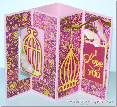
For the front of my card I cut out the birdcage from the Bloom Lite cart at 3” and used pop dots to adhere it to the front ‘lever’ panel. I had forgotten how much I liked this cart – there are some very cute images on it! (The digital version is on sale now at Cricut.com.) I stamped a sentiment onto cardstock and punched it out and adhered it to the bottom front of the card with pop dots.

Mother's Day Lever Card (2)

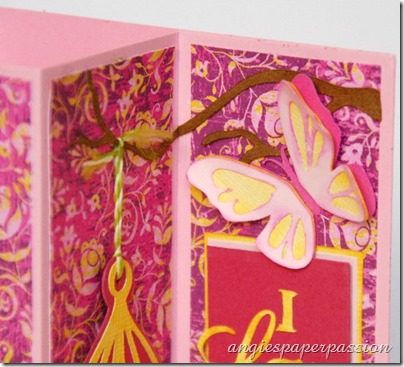
For the center panel, I cut out another birdcage from Bloom also at 3”. For this birdcage I decided that I wanted it to ‘hang’ from a tree branch that I cut from Serenade at 1.4”.  The branch is adhered so that it stretches across both panels. I then threaded some twine through the top of the cage and tied it around the end of the branch.

Mother's Day Lever Card (5)

The butterfly was a part of the second birdcage image and it has three layers, two of which are popped up with pop dots.

Mother's Day Lever Card (6)

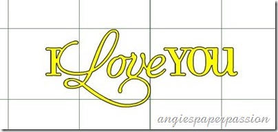
I wanted to add a Mother's Day sentiment to the last panel but most phrases were a little too big for this spot. I needed something no wider than about 1.5”. Here is just one of the reasons why I love my Cricut so much (ok, I know that should be plural as in CRICUTS!, LOL). You have the ability to manipulate the images to your liking! For instance, the “I love you” sentiment from the Artiste cart is actually one long phrase that measures 2.7” wide. I really couldn’t make it any narrower because it would’ve been too small to read or even to cut out nicely. At 2.7” wide, it was only 1.11” tall! So I left it as it was, and after it was cut, I hand cut the word “love” from the rest of the sentiment and rearranged it into a vertical sentiment!

Here’s a screen shot of what the phrase originally looked like in the Craft Room:

CCR Screen shot

I think it looks pretty good in it’s new arrangement! So there’s another challenge for you – if an image doesn’t work for you, change it!

Mother's Day Lever Card (8)

So there’s my Mother’s Day card! (Sorry the colors in my photos are the way they are. This paper is so much prettier IRL! It was just hard trying to get it to look that way here!)

Now head over to FCCB, get inspired by the other Design Team member projects, and then join in on this weeks challenge!

Mother's Day Lever Card (3)

If you’d like to learn how to make your own Lever Card, go to the tutorial here on Split Coast Stampers.

Don’t forget to check back tomorrow on Fantabulous Cricut Challenge Blog. I write a post there every Tuesday with Quick Tips! I’d love to hear some of your comments about my tips!

Supplies used:

  • Cricut Expression and Cricut Craft Room
  • CTMH Artist, Bloom, and Serenade Cricut cartridges
  • Sentiment stamp, label punch, patterned paper – Stampin’ Up
  • Twine – Pink Paislee
  • Ink – Tim Holtz Distress ink pad
  • cardstock, adhesive, pop dots

Until next time, Happy Crafting!

Signature

Fantabulous Cricut Challenge #157 ~ 3-D Project

Good Monday morning to all my crafty friends! I’m on the Fantabulous Cricut Challenge Blog Design Team and today we are starting a new challenge – create a 3-D project with at least one cut image cut with your Cricut! Well, this challenge was right up my alley. I LOVE creating 3-D items! So I decided to use one of the Cricut Craft Room Exclusives that I bought a while ago when it was on sale but until now I have never used it. I created the Branches Lantern from 3-D Lanterns. If you are just coming from FCCB, then this is the lantern that you saw -

3-D Lantern (2)

But after living with it for a while, I had to add some more stuff to it! It’s not finished until I say it’s finished and it just was not finished! So here is my new and improved 3-D Lantern -

12

As you can see I added layered flowers to all of the branches, a handle at the top that is secured with a bundle of beautiful rolled flowers and leaves. But let’s start at the beginning. These lanterns are so easy to put together and make great pieces for your home. If you use flameless candles you can even use these as night lights for little children.

You just need to cut out 4 of the same panel for this lantern and the 4 pieces of vellum for the inside. I cut this lantern out at 11.11”. But I added something a little different – I cut out 4 extra panels in Kraft cardstock to make the branches look a little more realistic.

01

First I carefully cut out all of the branches from 2 of the pink panels.

02

Then I cut out the branches from the Kraft cardstock but this time I left a small border around the branches.I only had to cut out 2 sets of branches from each panel of the Kraft. I left them in sets of 2 and 3. I attached a very thin (1/8”) piece of Scor-Tape to the pieces that I cut out but not actually on the branches.

03

04

I carefully placed the pink panel directly over the Kraft – hiding the sides and only letting the branches show through.

05

I then punched out tons of little flowers from different punches in different sizes.

07

I inked all of the flower edges to give them more depth.

09

After the flowers were all inked, I used my flower shaping tools from McGill to give all of them even more dimension.

08

I also added some Martha Stewart Branch Punches in green and Kraft.10

Here are the flowers that I put on each side of the lantern top. They were cut with a My Favorite Things die, Embossed with my Cuttlebug, inked and rolled. There are some made from cardstock and a couple made from vellum. I added a clear jewel in the center of each flower. Each butterfly was punched out in white cardstock and stamped with VersaMark ink and heat embossed with detailed embossing powder. I added some bling down the middle of the butterflies. The white on white embossing is so gorgeous – I really wish you could see the detail!

1621


Then I added the tiny layered flowers with clear jewels in the centers to all of the Kraft colored branches.

13

A handle was added and then I put a votive candle inside and turned off the lights. (I know that a flameless candle is so much better but unfortunately I couldn’t find any and this was just for a quick  photo op. Besides I’m still here, but thanks for your concern!)

30

Isn’t that beautiful?!?!?!? I am really liking these right now and I plan to make more. They’re so quick and easy, even if you makes alterations like I did. Think of the gifts you could create and match these to the recipients home décor! Please comment and let me know what you think! Will you be making some 3-D Lanterns soon? Also, think out of the box – the image that you cut with your Cricut does not need to end up looking like the picture in the handbook – make some changes – make it your own! There is no right or wrong in Art ~ just beauty!

Please visit the other designers at FCCB and see what designs they have come up with. And don’t forget to leave some “Blog Love” for everyone!

Supplies used:

  • Cricut Expression
  • Assorted cardstock, Vellum
  • Punches – Stampin’ Up, Fiskars, EK Success, Martha Stewart, The Paper Studio,
  • Die – My Favorite Things
  • Ink – VersaMark, Colorbox Chalk
  • Stamps – Background stamp by SU, Damask Chair by Stampendous
  • Rhinestones – Colorbok, White Blossom
  • Adhesive – Scor-Tape, Glossy Accents

Thanks so much for visiting and I hope you enjoyed my project today! Now it’s your turn – go create a 3-D project and link it up at FCCB!

Until next time, Happy Crafting!

Signature

LinkWithin