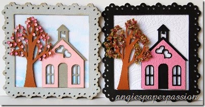
Decisions, decisions, decisions!!! One of the things I love about crafting is creating something and tweaking it to make it your own – putting your own spin on it! I love to make things, leave them out for a while, and then after looking at it over a few days, I may like to change a thing or two on it. You know what I mean! But when you have deadlines to meet, that may not always be possible – at least not right away. So that leads me to why I have TWO wedding cards for our challenge this week at Fantabulous Cricut Challenge Blog. We had to create a wedding card or gift and after I made my card (plus a couple of bride & groom gift boxes), taking my photos and uploading them, I started to have that nagging feeling that I wanted to change something. (why, oh why, can’t I make these decisions faster and make my life a little easier? LOL) So I’m going to share both of my cards with you today. Please take a look and leave me a comment on which one that you like the best! I’d really be interested in hearing your thoughts!
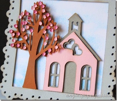
Here is the original card:
I used the Elegant Edges cartridge to create the card base, the white mat, and the grey frame. The card is cut at 6” and I used the Cricut Craft Room to weld two of the mats together to make the card base:
I layered the single white mat on the base and then the grey frame on top of that. The white layer is inked with light blue ink to look like clouds in the sky. I used foam adhesive to pop everything up.
The chapel is cut out at 4” from the Tie the Knot cart and the tree is cut out twice at 4.5” from the Bloom Lite cart. I used a very small flower punch to make the pink blooms for the tree. After I punched them out, I used my molding tools to shape them and then adhered them on with Glossy Accents.
“Chapel of Love” was also cut using Tie the Knot. I grouped the words together then welded them. This makes adhering so much easier! I also added a little of the Glossy Accents to the heart in the word ‘Love’.
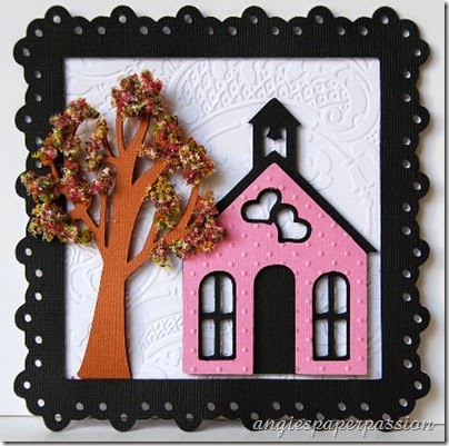
But like I said, I had a change of heart and created this version:
I changed the frame to black, the chapel’s shadow to black, and embossed both the white background (Acanthus by Anna Griffin) and the chapel front (Swiss Dots). Oh, I also used a deeper pink cardstock for the front of the chapel (almost didn’t catch that one, lol)
The tree is the same except this time instead of using punched paper flowers, I used Flower Soft for the blooms. Have you ever tried this stuff? It’s fun to use – messy, but still fun!
So there you have it – my decision process all over the place and the two cards that are the results! Have you ever done this – made something and after living with it for awhile, make changes to it? Please leave a comment and let me know. Also let me know which card is your favorite!
Since this post was SO LONG, I’ll pop back in tomorrow and show you the two wedding boxes that I also made (I promise there are no changes to those!)
Now head on over to FCCB to see what the other Design Team members have created for this wedding challenge and then make something yourself & upload it to our blog! Thanks for visiting today and until next time, Happy Crafting!


I like the first card better. Maybe the softer colours but I really like the flower soft for flowers. How do you adhere the flower soft?
ReplyDeleteThank you for your comment! There is a Flower Soft glue which is actually made by Aleenes. It is a high tack liquid glue. I have some but for this project I just grabbed my go-to adhesive, Scotch Quick Dry adhesive.
DeleteI too prefer the gray frame better but the flower soft tree on the black frame. Both cards are very pretty though and it is evident that a lot of work went into them. I agree with you about Flower Soft. I have three or four vials of that stuff and hate it because it is so messy!
ReplyDeleteThank you so much! I guess I should have gone with my first vision of this card and stuck with it, LOL! I do love my Flower Soft but I don't use it often because of the mess (I feel the same about all the glitter that I own, too). But I bought some little plastic food containers, labeled them, and transferred my Flower Soft into them so when I sprinkle it, the excess just falls back into the container. There is no way I could get it all back into its original little jar - the stuff seems to multiply on its own, LOL!
DeleteThanks again, I appreciate your comments!
So very pretty! I love shaped cards and think this card is absolutely so much fun and has character! Love the pretty tree... so sweet.
ReplyDeleteHugs,
Jo
I think both cards are great - I'm having a hard time deciding which I like better! The soft colors on the first one are so pretty, and perfect for a wedding. But I love the embossing on the second and how everything pops more with the black and the deeper pink. Both trees are great in the own way too! Making all those blooms for the first tree must have taken forever, molding every one. Flower Soft is great stuff - it looks so neat, but it sure is messy! Can I vote twice? Once for each card?? LOL!
ReplyDeleteI'm with Heather, they are both terrific!! I really like the pretty edging you added to the card base!!
ReplyDeleteHandmade wedding cards are really heart touching. I want to take the design of Wedding Cads with specific features so suggest me the collection in your next blog. If you really need the collections over Custom Wedding Cards for various religions then have touch in it.
ReplyDeleteWow, these are both beautiful! I love the the shape and the chapel and the tree looks fabulous! I think I am leaning more toward the gray/pink combo..just a little softer touch but they both are gorgeous! Nicely done!
ReplyDeleteSherrie K
http://sherriescraps.blogspot.com