Today I made a quick Minnie Mouse layout using the Disney Mickey & Friends cartridge. Yes, I said quick and the Disney cartridge in the same sentence! Some people have told me that they stay away from these types of cartridges because of the layering and the time it takes to make some of the images. Well, it’s not that hard at all if you follow these tips and if you use Design Studio or the Gypsy. Now these ideas are definitely not new. When I first starting using this cartridge and hit road blocks, I either worked at it until I figured it out or I went looking for answers. So it will really help new Cricuteers and could be a refresher course for others. Just please remember that this is how I do it and for now it works for me!

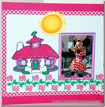
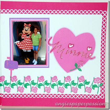
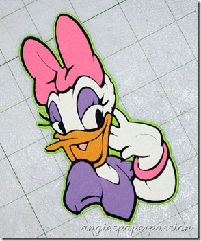
The sun, mailbox, and heart were all pretty easy to piece together. It’s mostly the images that have many, many parts, like Minnie’s house, that people have trouble with. First, I took a look at all of the colors of cardstock that I needed and gathered them together. Sometimes I even make a little cheat sheet for myself, especially if I’m not using the same colors that are in the handbook. Now here is the best part – there is no need to send your mat through the Cricut 8 times even if there are 8 different colors to cut! I’ll demonstrate using the Daisy Duck image on page 111. Using my Design Studio, I put all of the parts of Daisy’s image on the first mat. I cut it out at 4 1/2”. I then made a new page (you’ll find this by clicking on the View button) for each color and renamed each page according to that color. I then copied each part of the image separately and pasted it onto the page for its corresponding color.
Here is the first page with all of the images on it.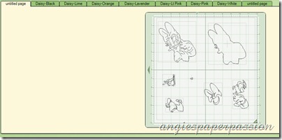 Below you can see how I labeled my pages.
 Here is another page.
 Below you can see how I labeled my pages.

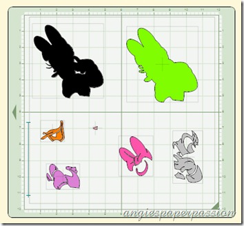
This helps me with paper placement on my mat. Now all I had to do was cut each color of cardstock a little bigger than the image and place it exactly on my mat like the images are placed on that last page. Just like this -


Thanks for visiting. Please leave a comment and tell me who your favorite character is from the Disney’s Mickey & Friends cartridge. Or, if Disney’s not your thing, what cartridge do you like that uses layers and which image on that cartridge is either your favorite or one that you have trouble with. I’ll be checking to see what you have to say.
As always, Happy Crafting,


What a great tip! I never thought of doing that! It would make it so much easier than keep looking back.."Okay what color was I going to do this again!!"
ReplyDeletewow, fantastic! Love this layout! Wish you could zoom/enlarge your pictures.
ReplyDelete